Themes & Styling
Customize the visual appearance of your story with themes. Storyfall’s theme system lets you set colors, fonts, and decorative elements that readers see when playing your story.
Overview
Every story has a theme that controls its visual presentation. Themes affect the colors, typography, and decorative elements readers see in the game interface. You can choose a genre preset as a starting point and then customize individual settings or customize a theme entirely from scratch.
Themes can be set at the story level or overridden per scene, so you could have different scenes use different themes. You can also build a theme library to share themes across multiple stories, which is useful if you’re writing a series and want a consistent look.
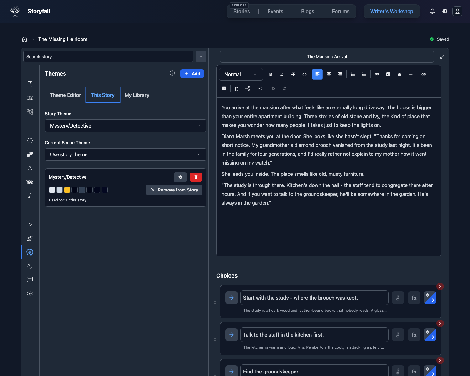
Accessing Theme Settings
- Open your story in the Workshop editor.
- Click the Theme button in the sidebar.
- The Theme panel opens with all customization options.
Genre Presets
When you create a story and select a genre, a matching theme preset is applied automatically. Presets are available for all genres including Romance, Fantasy Adventure, Horror, Sci-Fi Space, Mystery Detective, Cyberpunk, Western, Post-Apocalyptic, Zombie Apocalypse, Historical Fiction, Modern Thriller, and Drama. Each preset sets colors, fonts, and decorative elements to match the genre’s tone.
You can customize any preset’s settings afterward, or start from scratch with a custom theme.
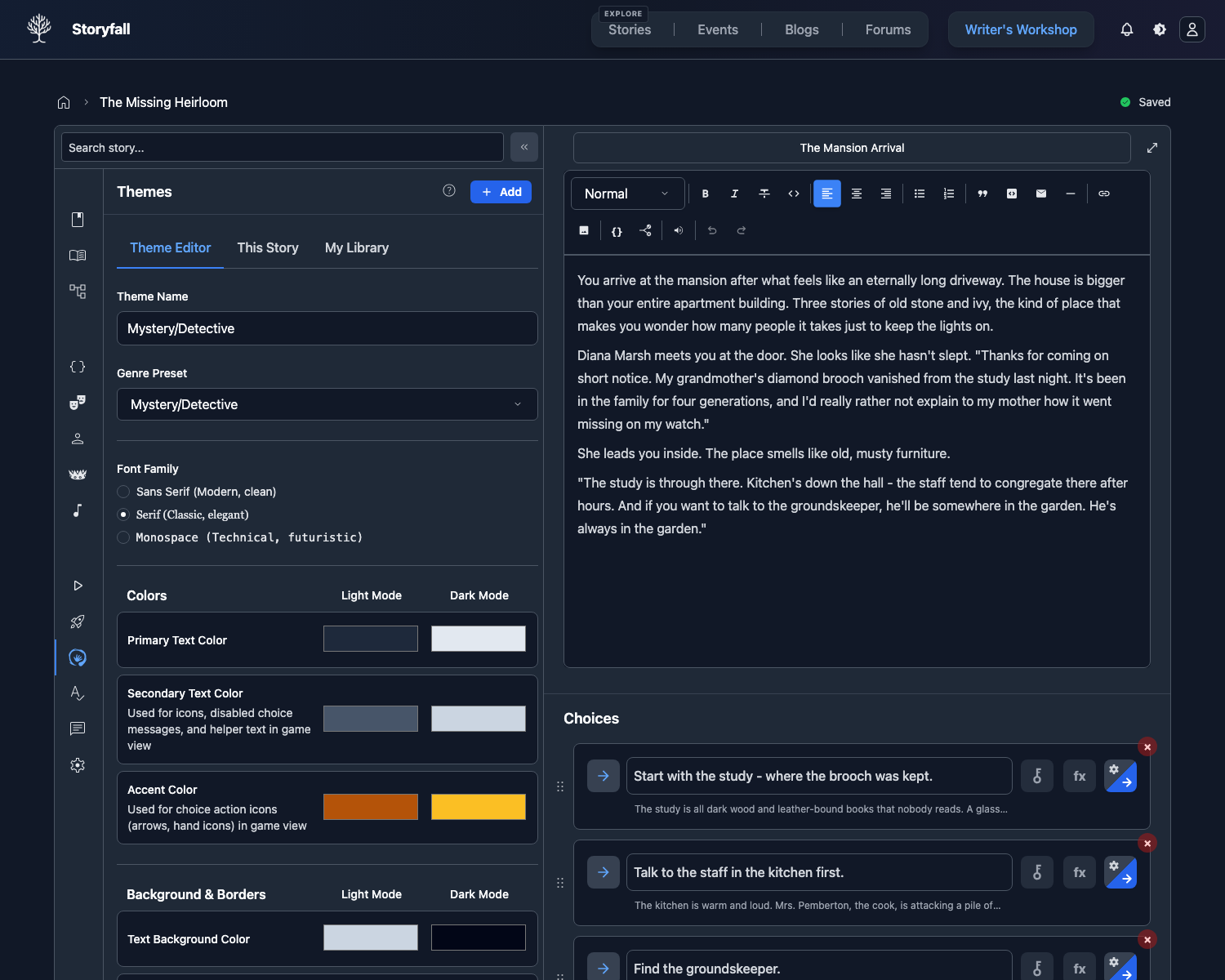
Custom Colors
Fine-tune your story’s color palette by editing individual color values:
Primary Color
The main accent color used for buttons, links, and highlighted elements.
Secondary Color
A supporting color for secondary UI elements and accents.
Accent Color
Used for special highlights, notifications, and emphasis.
Background Color
The main background color of the reading interface.
Each color can be set using the color picker or by entering a hex code directly.
Font Selection
Choose the font family used for story text:
- Sans Serif - Clean, modern look (default).
- Serif - Classic, literary feel.
- Monospace - Technical or typewriter aesthetic.
The font applies to all story text including scene content, choices, and variable displays when readers keep Story default selected in their game settings. Readers can choose a different font or adjust readability controls for legibility without changing your saved theme.
Decorative Elements
Add visual flair to your story’s interface with decorative overlays. There are several presets to choose from, or you can upload your own SVG for a fully custom decoration. Decorative elements appear as subtle overlays on the reading interface without interfering with text readability.
Dark Mode
Themes work with both light and dark mode. Each color setting has a light and dark mode value that you set separately. Readers can switch between light and dark mode using the toggle in the game interface, and your theme adapts accordingly.
App Appearance Variants
The navbar theme switcher controls overall app appearance:
- Light, Dark, or Auto mode.
- Palette variants: Classic, Midnight Blue, Parchment, and Forest.
- Palettes update neutral and semantic UI colors, including primary/info accents and status tones (success, warning, error, special accent, and premium gold) used by buttons, badges, alerts, and toasts, with palette-aware foreground contrast tokens for filled states.
Use these to personalize Storyfall’s interface without changing your story’s saved theme data.
How Readers Experience Themes
When a reader plays your story:
- The theme loads automatically when the story starts.
- Colors, fonts, and decorative elements are applied to the reading interface.
- The reader’s light/dark mode preference is respected.
- The reader’s font and readability preferences are respected. Story default uses your theme font, while reader settings can adjust the reading surface without changing your saved theme.
- Theme changes between scenes happen automatically.
- Readers can disable themes entirely in their game settings if they prefer the default look.
Next Steps
- Audio & Music - Add background music to complement your visual theme.
- Editor - Write and organize your themed story.
- Publishing Your Story - Share your styled story with readers.